INFO: Occupy Space, Winter 2014, occupyspace.com
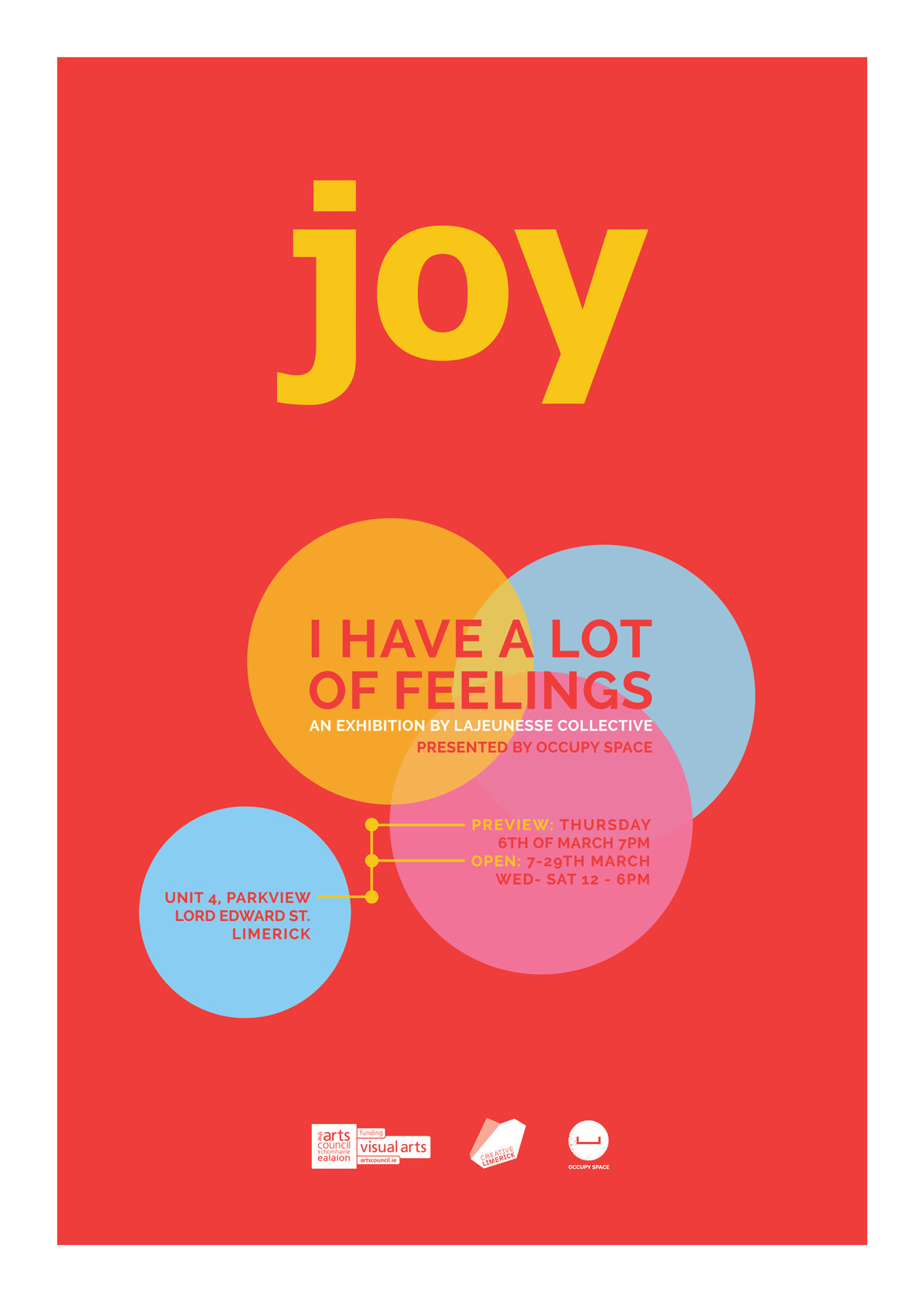
This was about the most minimal image I’ve ever been given to design a poster with. I did have the benefit of checking out some of the other imagery from the show aswell as listening to an Arena podcast interview with the artists so I had a reasonably good idea of what they were looking for.There was another version with a darker themed palette I liked but we ended up using the ‘ice-cream’ colours to tie in with one of the exhibits.


