INFO: Occupy Space, Autumn 2013, occupyspace.com
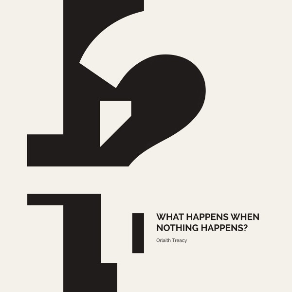
Once I had come up with a suitable abstract image to use for the cover (a typographical vector stock image) I experimented with creating interesting negative shapes using the abbreviated title. The color palette still reminds me alittle too much of an anatomy diagram : P but the alternate text contrast works well between the back and front of the brochure.