INFO: Shem Caulfield, Winter 2012, shemcaulfield.ie
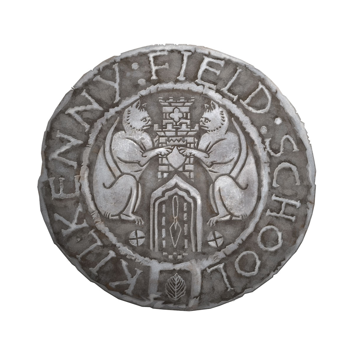
This logo was initially quite a challenge as it was one of those commissions when its only what the client see’s what they don’t like that they start to better describe what they do. I had initially designed a few mock-ups that were much more graphic/abstract. From these I started to make something more illustrative. The logo needed to contain elements that referenced Kilkenny (cats and castle/tower) and archaeology (trowel and measurement icons). I researched some medieval coins and heraldry to get the texture and style and came across the excellent King Harold font which did the trick the logo typography.


