INFO: Judith Lardner, Spring 2014, a href=”http://judithlardner.com/” title=”judithlardner.com”>judithlardner.com
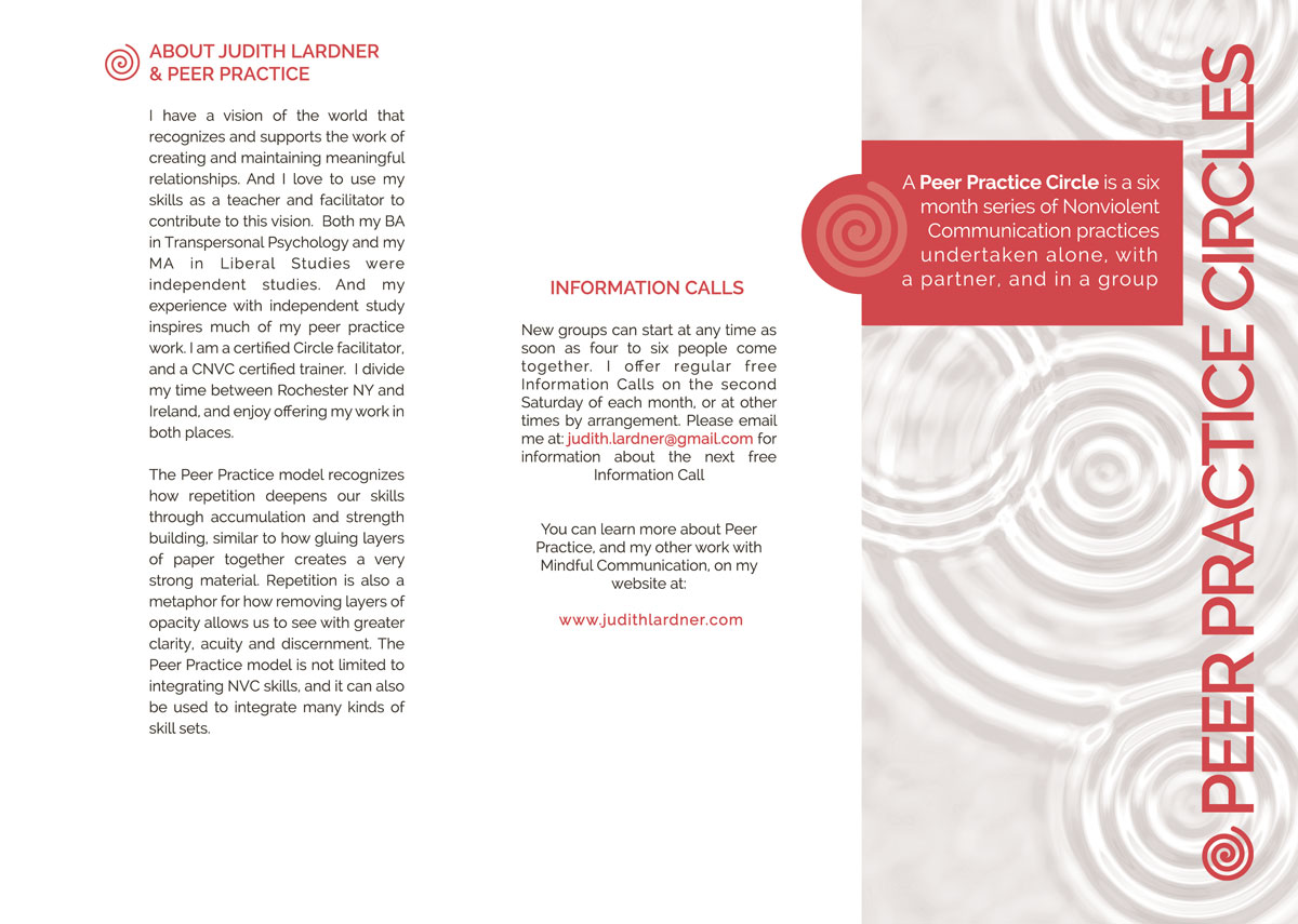
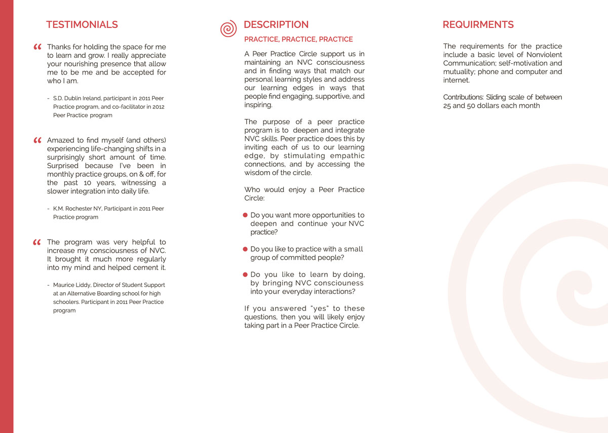
This brochure needed to be fairly restricted color wise as initially it was going to be duplicated on a domestic printer so ink cost was a factor. Due to the subject matter the typography needed to be spacious and clean and we also kept the graphic elements to a fairly minimal set.

