INFO: Occupy Space, Winter 2014, occupyspace.com
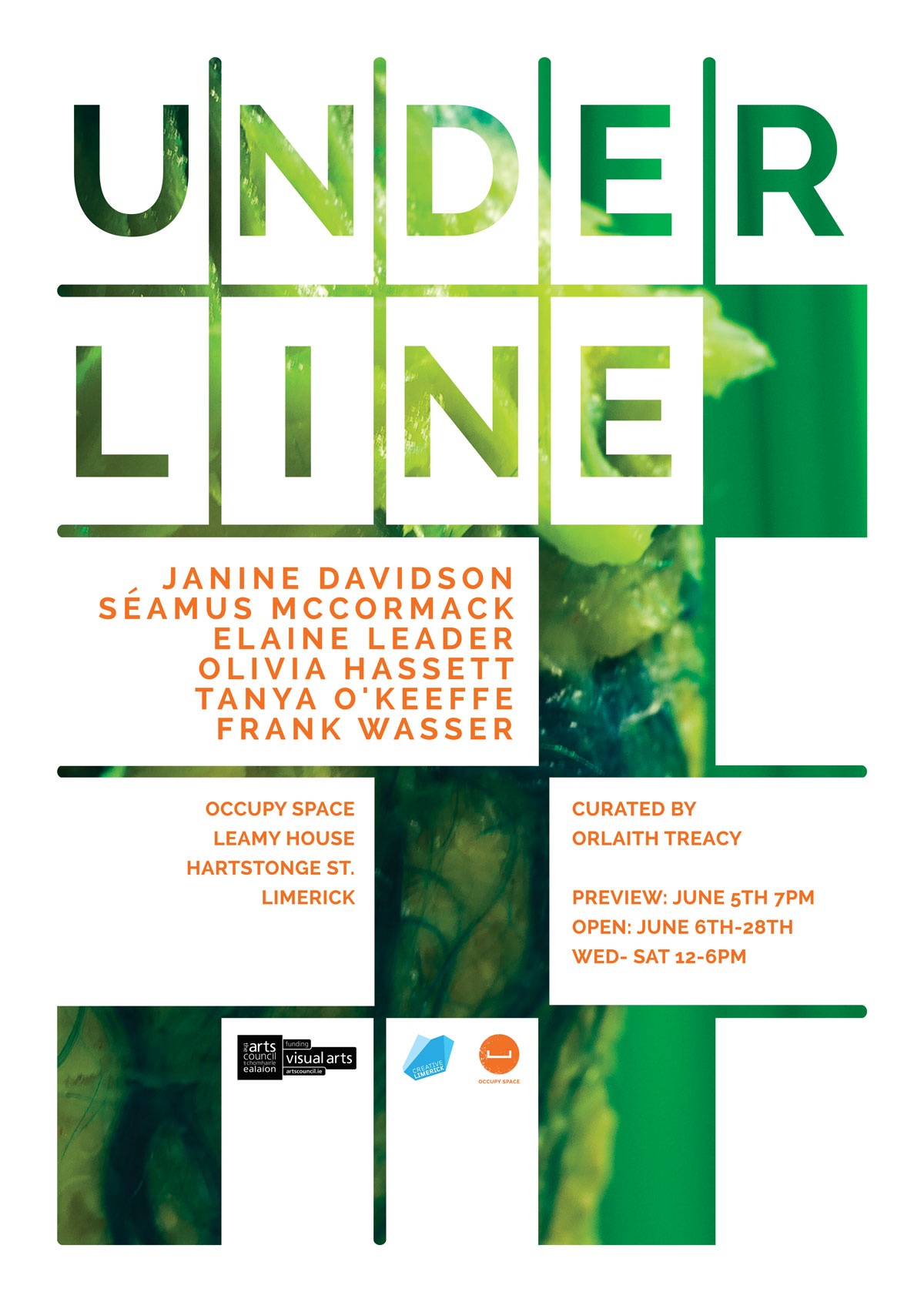
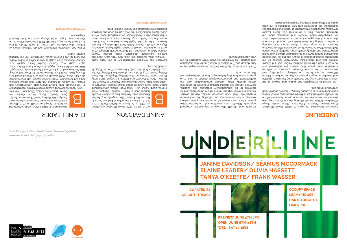
The mock-up we ended up going with (sub divided single letters) ended up being alot more difficult to execute than I had initially thought it would. The background image was undefined and strong enough, color wise, to pop out the large letters but getting the logos and small text to fit right in the other rectangular areas proved tricky to do. It was also difficult to find complimenting background colors to go alongside the vibrant green.
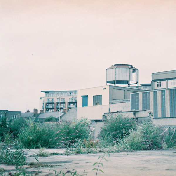
Feat. image by Tanya O’Keefe.

