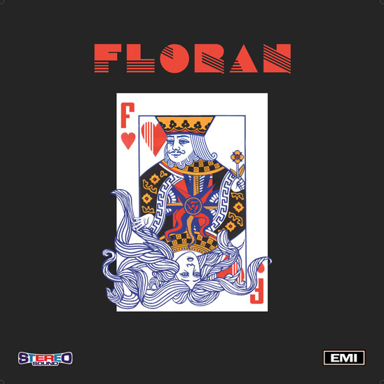
Worked on an unusual commission during the week; a mock Vinyl LP cover for a client in Limerick. The briefing keywords included ‘compass, contrasting manic with logic/stillness, humour and Disco/Chic era’). I messed about with melting compasses ala Dali abit and abstract chaos’ish patterns but found them to be too non-descript so I ended up using a playing card theme (similar to the recent WB Gallutep poster I made). I figured I could use the flip side characters to represent the contrasting emotions and could fit the compass into the symmetrical center. There was alot more work involved in illustrating the loose hair than I’d thought but I’m happy enough with how it turned out (see below).
Speaking of illustration related stuff I started going thru these tutorials recently (dunno if I mentioned them before – but in any case its a damn’dably impressive free online course – fair play to the creator Matt Kohr). One of the biggest difficulties I find in digital painting/drawing is getting used too the pen/tablet/screen workflow as opposed to just pen and paper. I’ve always struggled with this but going by some of Matts suggestions (he clearly breaks down both the benefits and obstacles in an impressively detailed fashion) I plan on adding digital painting into my daily half hour life-drawing sessions (using a mini Wacom tablet and laptop). Hopefully after a few months of this it’ll improve both my vector drawings and my confidence when working with Illustrator.