INFO: Keogh Publicity, Spring 2011
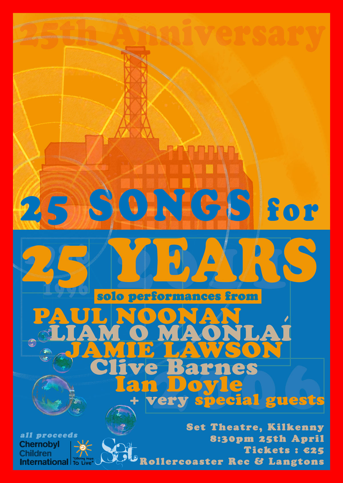
I wasn’t too sure which way to go with this at the start as it needed to catch the eye but be sensitive to the material so in the end, as usual, simpler was better. The inverted colours helped make the title stand out and the faded image of the power plant wasn’t too obvious but still lent a graphic element to the poster. I thought the bubbles contrasted the blue nicely to represent the children’s charity.