INFO: Jessie Wilkinson, Summer 2015 This was a pretty straightforward project as Jessie had a very good idea of what she wanted. She had plenty of examples of labels she liked aswell as clear points on what she did’nt like so I was able to…
All Portfolio Posts

INFO: Breast Cancer Research, Spring 2015, thepuddingbrand.com I actually developed a huge amount of concepts for this logo, the most I’ve ever done on a single project – around thirty all together. We experimented with various ideas using DNA stands, hexagons, molecules and the like…

INFO: Chris Reed PT, Spring 2015, reedpt.com.au I developed quite alot of concepts for this logo as Chris was happy to budget extra time for testing out the various ideas he had. The old school strongman, built around ‘C’ and ‘R’ shapes was my favorite…

INFO: Prospect Architecture, Summer 2014, thepuddingbrand.com This was an interesting project to work on as initially I tried a few ideas based on floorplan and structural themes. In the end thou these were too rigid and corporate and the client went for a more abstract…
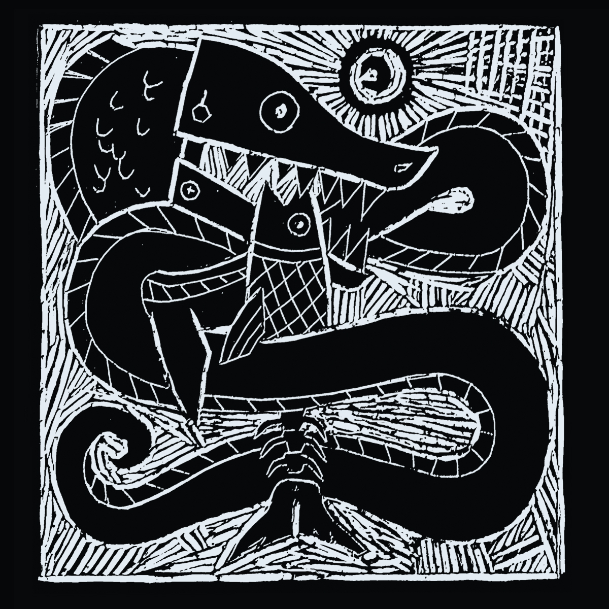
INFO: demo, 2016, mp3 single, unreleased There was abit of a learning curve involved in making the lino poster and illustrated notation as I had’nt done either before and its a template I was hoping to use on for the rest of the acoustic based…
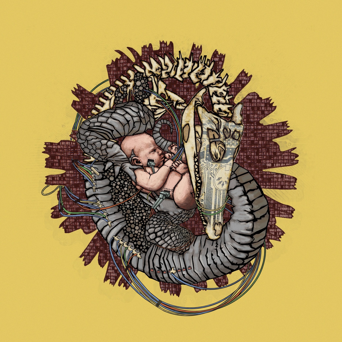
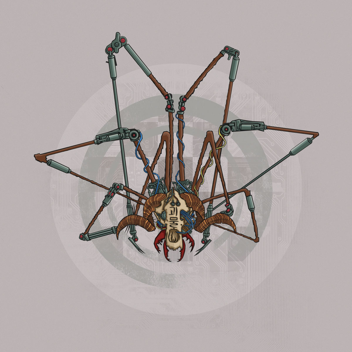
INFO: demo, 2012, mp3 single, unreleased This was the first demo release I made since Gardens & Graveyards. Considering that was such a fuck-up I wanted to make sure any new material I made was’nt too busy or overly dramatic (emotionally indulgent). The goal for…

CLIENT: Paulette Egan, Spring 2014, template theme. sportsyoga.ie I’ve generally found that clients who write regular, if any, blog posts are far and few between but Paulette already had a very busy site with lots of regular content so the biggest job was re-organizing the…
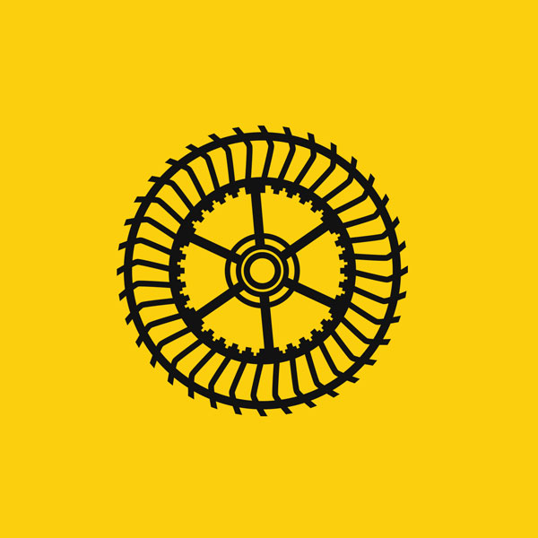
INFO: Alex Meldrum, Summer 2014, grennanmill.net A signature feature of Grennan Mill Craft School is its yellow doors and windows. It made sense to use this as the background color and I converted a photograph of the the mill wheel into a vector image in…
