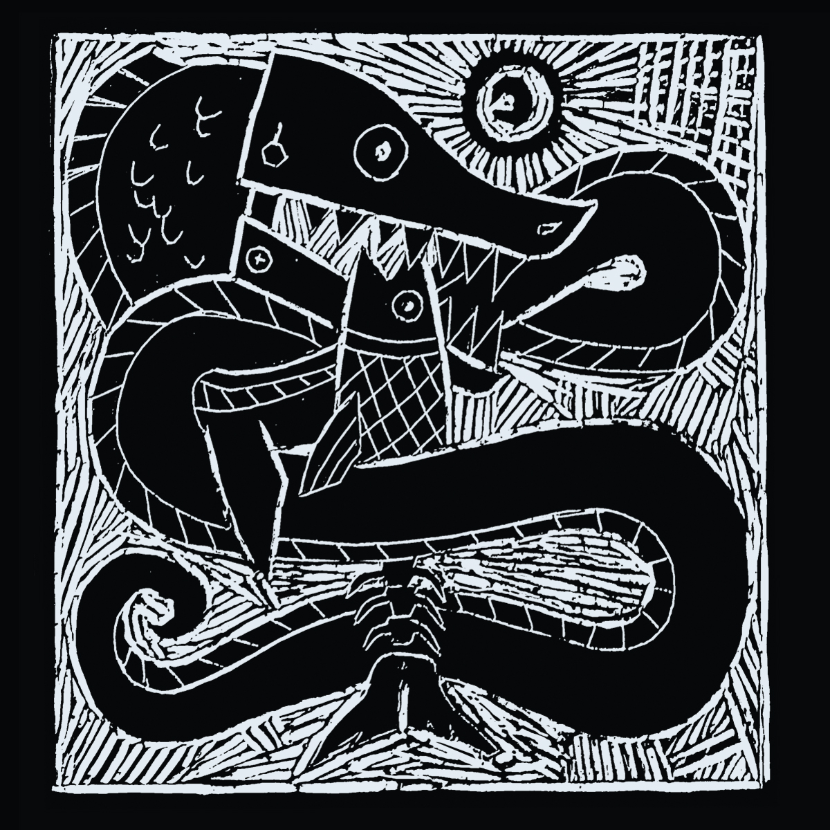
INFO: demo, 2016, mp3 single, unreleased There was abit of a learning curve involved in making the lino poster and illustrated notation as I had’nt done either before and its a template I was hoping to use on for the rest of the acoustic based…
All Portfolio Posts
CLIENT: Paulette Egan, Spring 2014, template theme. sportsyoga.ie I’ve generally found that clients who write regular, if any, blog posts are far and few between but Paulette already had a very busy site with lots of regular content so the biggest job was re-organizing the…
INFO: Alex Meldrum, Summer 2014, grennanmill.net A signature feature of Grennan Mill Craft School is its yellow doors and windows. It made sense to use this as the background color and I converted a photograph of the the mill wheel into a vector image in…
INFO: Occupy Space, Summer 2014, occupyspace.com This was an great image to build a design around. The original was abit busy for a poster thou so I reduced it to an outline in Illustrator which then allowed us a greater choice of background colors to…
INFO: Helen Faulkner, Spring 2014, helenfaulknerceramics.com This commission was straight forward enough to do as Helen already had a very clear idea what she wanted. Once I had a few pictures of the stamp she uses on her pots I just needed to figure out…
INFO: Occupy Space, Winter 2014, occupyspace.com The mock-up we ended up going with (sub divided single letters) ended up being alot more difficult to execute than I had initially thought it would. The background image was undefined and strong enough, color wise, to pop out…
INFO: Judith Lardner, Spring 2014, a href=”http://judithlardner.com/” title=”judithlardner.com”>judithlardner.com This brochure needed to be fairly restricted color wise as initially it was going to be duplicated on a domestic printer so ink cost was a factor. Due to the subject matter the typography needed to be…

