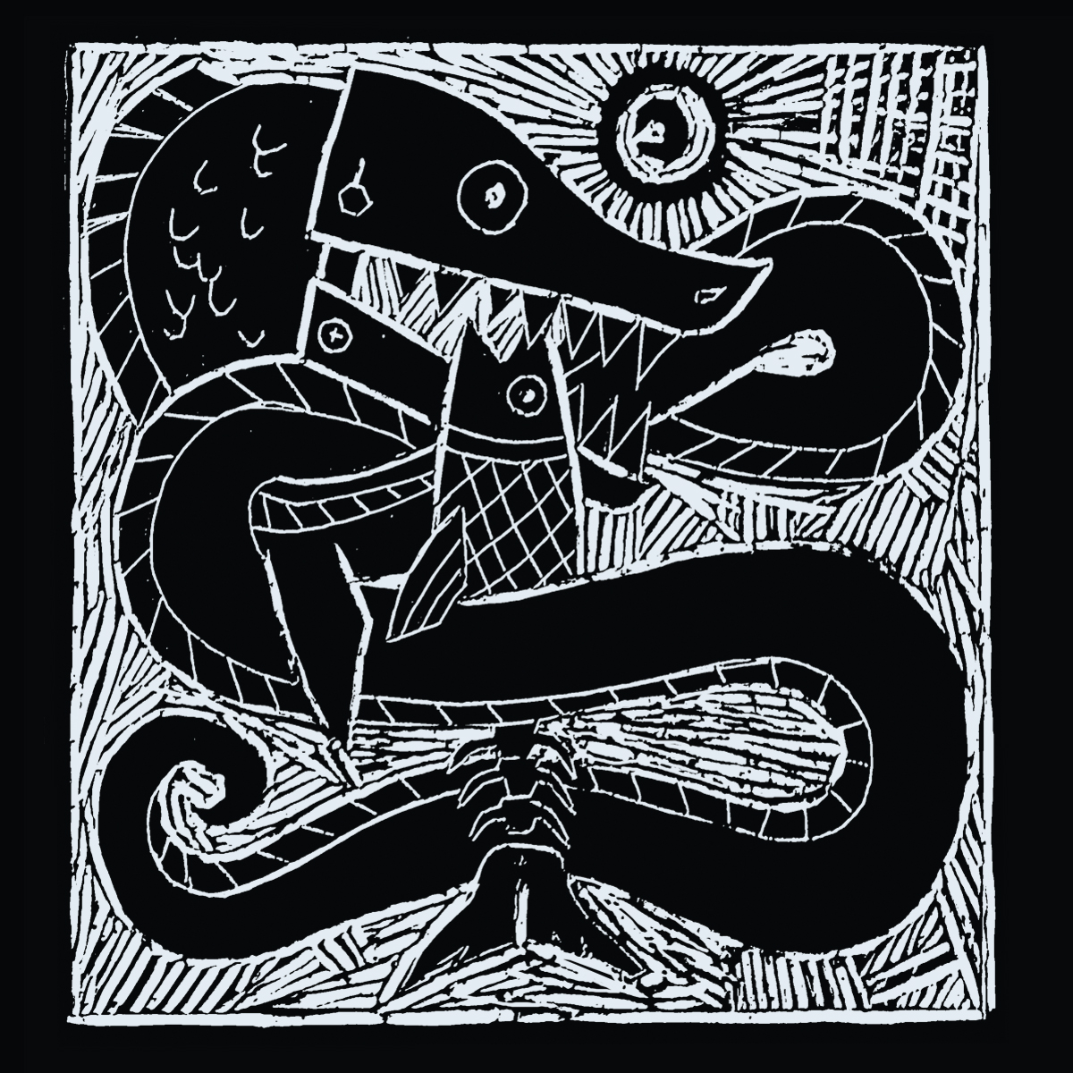
INFO: demo, 2016, mp3 single, unreleased There was abit of a learning curve involved in making the lino poster and illustrated notation as I had’nt done either before and its a template I was hoping to use on for the rest of the acoustic based…
Tim Harper
Now that I have the storyboard and shadow puppet animations completed for the Circles music video I just need to record the demo and then myself and my brother can start shooting the various scenes.
Having worked my way thru notating five of the seven acoustic tracks I’m hoping to finish up the last two before the end of the month. ‘Old Tin Drum’ is proving quite difficult to fit within the double sided A3 format I had initially set…
I had initially planned on the ETD track as being my first music video but as its pretty much all external night shooting I thought I should start with something easier – to grease the wheels with so to speak. To that end I decided…
One of the main down sides to computer related work is being seated for most of the day. The interweb is rife with the long and short term health risks of such desk intensive occupations. Over the last six months I’ve tried to get in…
It’s been a busy few weeks on the commission front since the start of the new year, mostly with customizing WordPress themes. Having worked on several such sites using templates from the Themeforest library I’ve come to realize what a big difference there is between…
Having worked thru the first four compositions based on the Brothers Grimm stories (see last blog post for more info) I’ve started to get a better idea of both the limitations and potential of my workhorse orchestral sample libraries. On the plus side there’s a…
Having finished up the few counterpoint and orchestration related online courses at the end of the summer I was keen to get cracking on some composing again. In order to create ‘fake’ projects/briefs for practice material I previously used randomly chosen pages from books as…
I’ve used Notepad++ as my default web development program ever since I switched from visual based layouts in Dreamweaver CS3 to building with code (about six or seven years ago). Although an excellent text editor, and a free one at that, I’ve always wanted something…


